Making a Step Progress Bar Component
The other day at work I had to write a step progress bar acting as an indicator during an ordering flow. I’ve written such a component once or twice before, and didn’t really like the approaches I’ve used before. So I set out to do a proper one, with usage of semantic correct HTML elements and flexbox. In this post I’ll go over the HTML part and the CSS part (which will account for the most). I’ll be using the BEM methodology here and writing all my CSS in SASS.
TLDR;
If you’d just like to skip ahead and see the finished component, check out this pen.
HTML markup
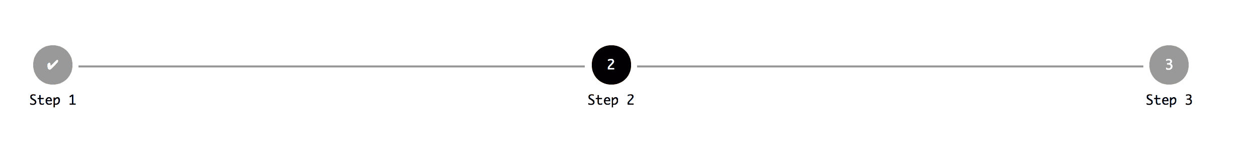
As mentioned before I’ve done one or two of these components in the past, and at least once resorted to just using a bunch of <div>’s and some magic absolute positioning in order to make it look nice. That’s definitely not how I would do it today, because if you think about it, it’s basically a list.
So why not just make it a list?
I’ve chosen to make it an unordered list, because I’m using some unicode characters to indicate a “completed” step and not only numbers.
If you don’t need that, you might as well just do an ordered list. That also makes some of the CSS below unnecessary.
Anyway.. The HTML:
<ul class="step-progressbar">
  <li class="step-progressbar__item step-progressbar__item--complete">
    Step 1
  </li>
  <li class="step-progressbar__item step-progressbar__item--active">Step 2</li>
  <li class="step-progressbar__item">Step 3</li>
</ul>
Quite simple stuff going on here. An unordered list, three items within it. The first one is supposed to act as “completed”, second one “active” and the third one just default.
Moving on..
CSS styling (SASS)
So now time for the interesting stuff. But there’s a couple of things to notice here before digging in.
We’ll be using pseudo elements, :before and :after. :before to style the circular steps, and :after to style the line between the steps.
We’ll also be using counter-reset and counter-increment to control the logic of counting the steps. This allows you to do some fancy custom stuff, like if you for some reason only wanted to have even or odd numbered steps.
That’s pretty much it. The remaining stuff is flexbox, positioning and colors.
.step-progressbar {
  list-style: none;
  counter-reset: step;
  display: flex;
  padding: 0;

  &__item {
    display: flex;
    flex-direction: column;
    flex: 1;
    text-align: center;
    position: relative;

    &:before {
      width: 3em;
      height: 3em;
      content: counter(step);
      counter-increment: step;
      align-self: center;
      background: #999;
      color: #fff;
      border-radius: 100%;
      line-height: 3em;
      margin-bottom: 0.5em;
    }

    &:after {
      height: 2px;
      width: calc(100% - 4em);
      content: '';
      background: #999;
      position: absolute;
      top: 1.5em;
      left: calc(50% + 2em);
    }

    &:last-child {
      &:after {
        content: none;
      }
    }

    &--active {
      &:before {
        background: #000;
      }
    }

    &--complete {
      &:before {
        content: '✔';
      }
    }
  }
}
Conclusion
This should give you a fairly good starting point if you need a step progress bar in your project or app. It should be fairly simple to customize and extend upon, if needed. If you need some help with it, or anything else, reach out to me on Twitter and I’ll gladly help out.